S.C. Nash Counseling & Consulting wanted to change the look of their business to attract a queer and feminine audience. The client wanted an elegant look to their brad. S.C. Nash Counseling needed a new logo design as well as a simpler website design.
The Solution
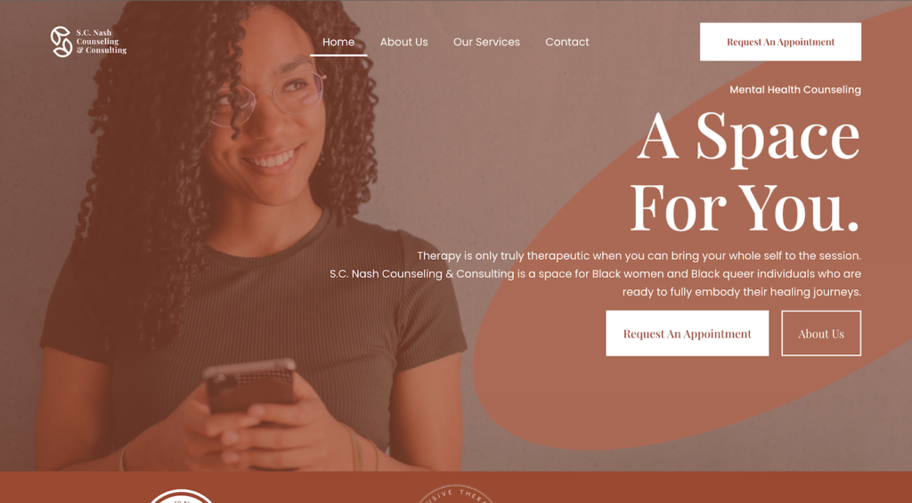
Through market research, we came up with the solutions for the companies branding (logo, tone, messaging, imagery) and website design.
The new logo is simple, yet elegant. The icon incorporates custom letters that, when combined, creates the letter “S.” When separated, it creates the letters “C” as well as “n.” As an image, the “letters” also create two lips (tulips).
The website utilizes and elegant font as well as space. The space is left in order to force to viewer to, first, connect with a human face, and then avert the viewer’s gaze to the right-aligned text .